Monday, July 29, 2013

Monday inspiration / neon

I'm working on a new project this week (am creating some colourful artwork) 
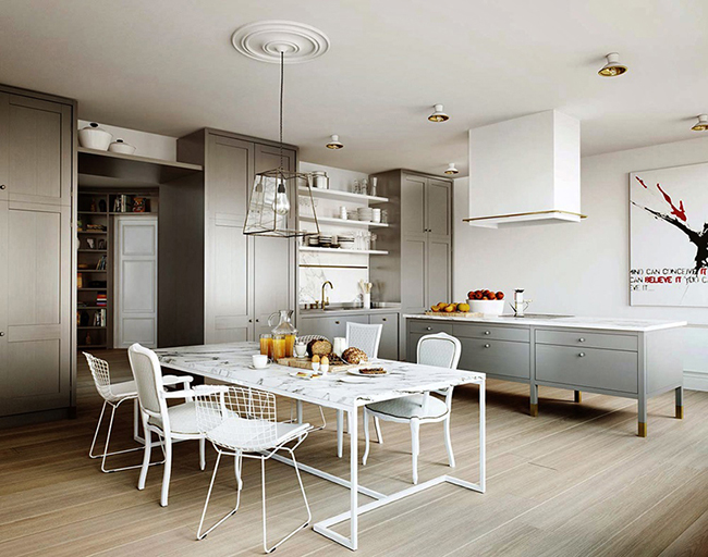
The image below inspired me (it's on my mood board right now)
I love the look of neon and grey together - I think it's super cool, don't you?
Why does it work?
In this case the splashes of neon are balanced by the grey background wall and the pale timber floorboards which create a much needed 'rest area' for the eye and add a subtle warmth to the room without being overpowering - it's perfection if you ask me.
I think this would make a great studio or 'chill out zone' for teenagers and/or grown-ups.
What would you add? What would you take away?
Would you live with neon?


CLx

image via here

Thursday, July 25, 2013

White + gold + black

When you spend all day, everyday thinking colour combos, interiors, art and furniture like me, you might (only occasionally) feel a tiny bit tired of bright colours and busy rooms -  thats when your inspiration board might start to look a little like mine (lots of white and neutrals including shells, pebbles and twigs). White (the right shade of white - see my post here) instantly injects peace and tranquility into a space especially when paired with neutrals...I like it with splashes of gold and black, it's elegant and warm - I've used white + gold + black in my latest scheme/project, for a beautiful new, open, airy and bright living room. Here's what inspired my colour scheme


CLx


images the glossier nerd


Monday, July 22, 2013

Monday inspiration / a splash of colour

I am a great supporter of neutral walls and floors, a blank canvas is in my opinion a great way to showcase colourful art, furniture, accessories and beautiful objects. 
A wonderful example of the above theory is the stunning home below (via the design files) sporting gorgeous neutral walls and floors...who said neutral interiors had to be boring? On the contrary they can be very exciting indeed - just judge for yourself.


colourful art can look incredible

quirky and gorgeous lemon stand

a splash of colour outdoors, gorgeous!

a photo mural...stunning choice, don't you think?

red stools...yes please!


CLx

images via the design files


Wednesday, July 17, 2013

Selecting natural stone for your home

The process can be daunting due to the great variety of styles, cuts and finishes that are available on the market today but it can be simplified by observing a few simple rules.
1) Style - it's very important to know where you are heading with your design/look, collect as many pictures as possible, pick a couple of styles that you really like, make sure you know what 'final look' you are after;
2) Do some research - look for a supplier online, read a few articles, find out more about the stone you are thinking of using;
3) Get familiar with some of the terminology - honed, filled, unfilled, etc.;
4) Visit a supplier to make sure that you know what the product looks like + ask as many questions as possible (now is the time) and make sure that the stone you choose is the right one for the job/area.

A favourite of mine is Carrara marble, I like to use it in kitchens and bathrooms, for it has a timeless appeal and once treated it is very easy to maintain; it can suit different styles too which is fantastic and marries well with numerous paint colours and styles of cabinetry; it also looks great used as a detail (see here)

via here
via here
via here
Another favourite of mine is travertine, I love the variation of colour and texture plus it looks great both inside and out, the larger tiles look particularly striking outdoors (see link to project below)

caldesign

more pictures here.

CLx


Wednesday, July 10, 2013

A vision in white

My current project has been inspired by this Swedish apartment seen here. It's going to be an 'all white interiors' and am in the process of selecting colours for the walls, skirting + materials - an easy task for a colour consultant you may think but that's not always the case. 
So what is the process I go through when selecting a colour? (in this particular case the right shade of white)
First of all I take a couple of elements into consideration, those elements being:
1) The style (of the house) - cool shades of white are better suited to contemporary homes while creamier/yellower shades look great in more traditional/older style homes;
2) Light - very important element when painting a room - the position needs to be taken into consideration (north facing rooms are brighter, warmer and therefore can afford a cooler and/or darker shade, while south facing rooms will need a warmer/lighter shade depending on the look one is trying to achieve). It's important to observe how the light changes during the day - this can be achieved by painting a few shades of white on reasonable size boards and have them placed in the room/s for a couple of days.
I'll also have to consider:
3) The mood/feeling the client wants to achieve in the room - it's important to establish/learn what the space will be used for;
4) The furniture and art they'd like to include in the scheme - often a rug or a collection of artwork are a great starting point for a colour consultant.
After the initial consultation with the client (where I collect all the relevant information, including the elements above) I return to my office and start to put a mood/presentation board together. I usually return to my client a few days later, with ideas, colours, pictures and sketches (when applicable).


More white inspired pictures (on my inspiration board atm)


images via here


CLx


Tuesday, July 9, 2013

A day in the life / Roseville public school project


The first stage of work under the school master plan is nearing completion and as the principal said, looking on at the turf finally going down, that it was a “momentous day” in the life of the school. We were all surprised and relieved that the grass had good colour and it was all hands on deck this morning getting the 900 square metres of Santa Ana couch installed. Jess and the team from Dad & Dave’s Turf and the boys from Harrison’s and Ausflow were all there and CALDESIGN keeping an eye on things.
Stage 2, featuring a synthetic grass playing field, is the next project and we are all very excited to see this get under way.


Keep an eye on the website for more info/pictures

AL.


Monday, July 8, 2013

Swedish inspired


These images are on our inspiration board at the moment, we are working on a new project (inside+out) and this is very much the feel/look we would like to achieve. Inside...white walls and pale floorboards (always a great combo) plus quality finishes (marble, limestone) beautiful cabinetry and striking artwork. Outside a beautiful terrace (designed to entertain family and friends) lovely and comfy outdoor furniture and of course a bbq area...that's the plan. Visit us here to see some of our previous work and what we are up to.

CLx

images via share design

Wednesday, July 3, 2013

Loving / pop of colour

blue & purple


blue armchairs


bright feature wall 


red lounge


dots


I'm loving pops of colour at the moment and for my own designs/projects I am opting for bright feature walls, especially in kids' playrooms - so much fun -  and bright/colourful artwork (like the dots above) or furniture (red lounge and blue armchairs above)  in family and lounge rooms. They look great on both dark and neutral backgrounds and they add an element of fun and surprise to a room. In bedrooms I like to use slightly more sophisticated and subtle colours and accessorise with blue & purple (top image) so lovely.


CLx


images solid frog, tumblr